Mapping the portfolio strategy
Universal credit, DWP, 2021
As part of my service/interaction design role, I was tasked to visualise the new portfolio team structure as it was rolled out and implemented into the Universal Credit digital programme.
#Background
Portfolio teams were introduced to the Universal Credit (UC) digital service to sit strategically above and across individual theme (delivery) teams.
The theory being: theme teams are set up to work on specific areas of the service, but they struggle to deliver work that spans multiple areas. Previously, things like onboarding and global navigation were hard to ‘own’, but now one of the Portfolio teams could coordinate and deliver this.
Across the whole of the digital service, ten portfolios were established with six of these (below) covering user-facing parts of the service.
Portfolio teams sit strategically above and across theme teams.
#Our portfolio
My theme team’s portfolio was called ‘Help people claim UC’. In terms of a user’s experience with UC, this is the first one they would encounter. It runs from pre-claim, through onboarding and making a claim, to their first payment.
The phases in our portfolio’s user journey.
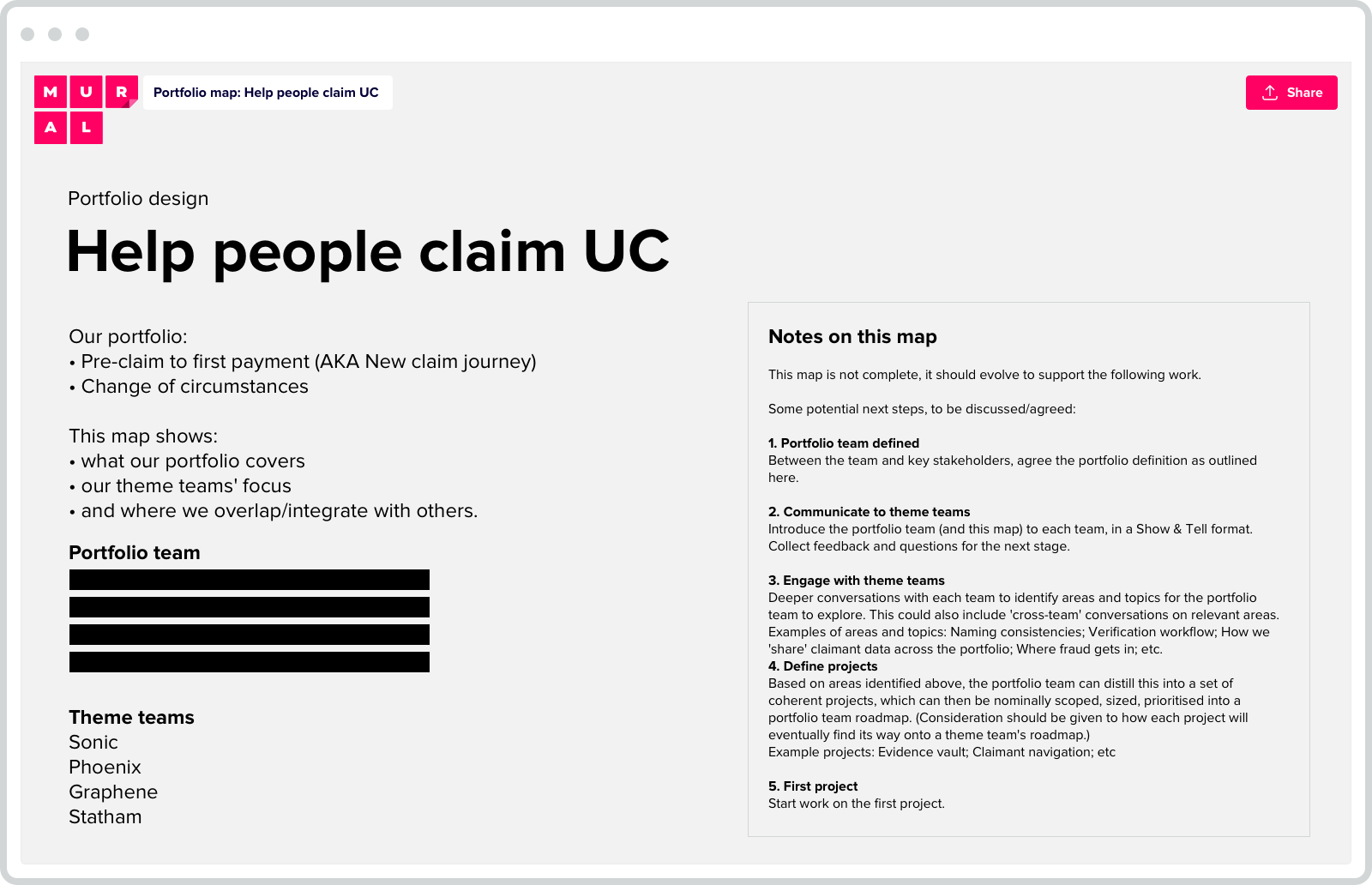
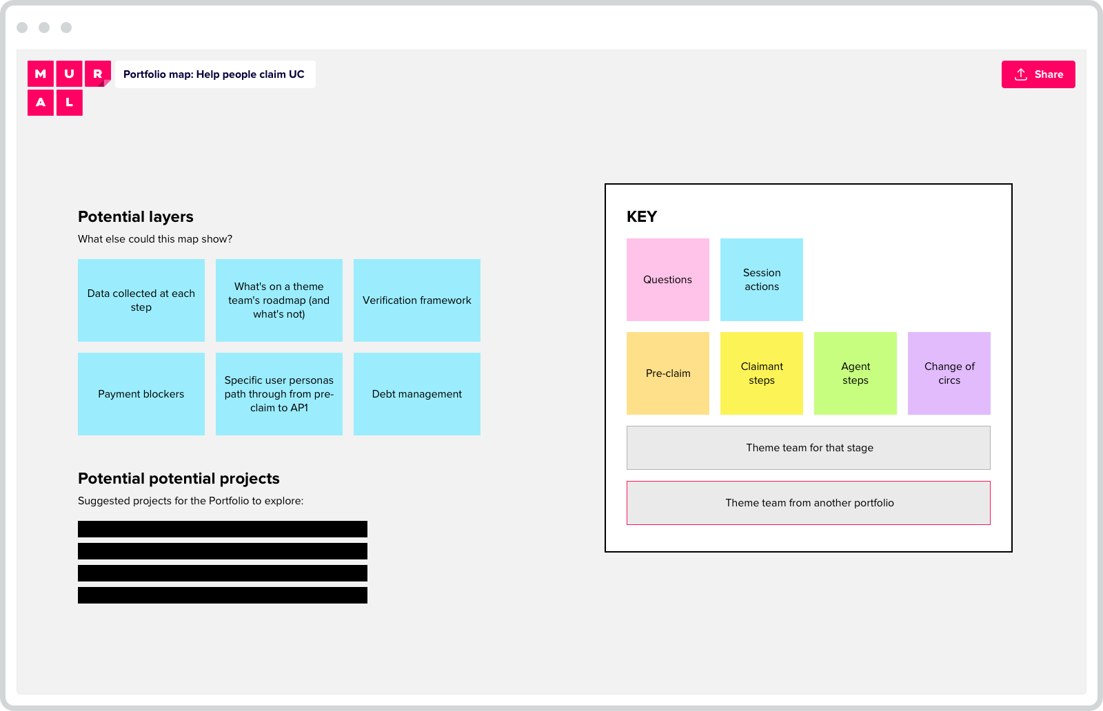
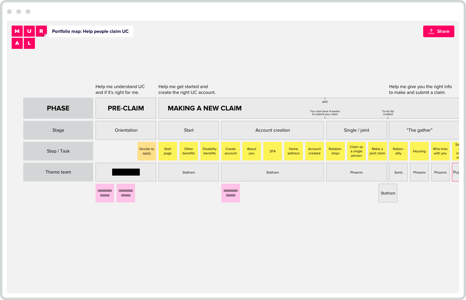
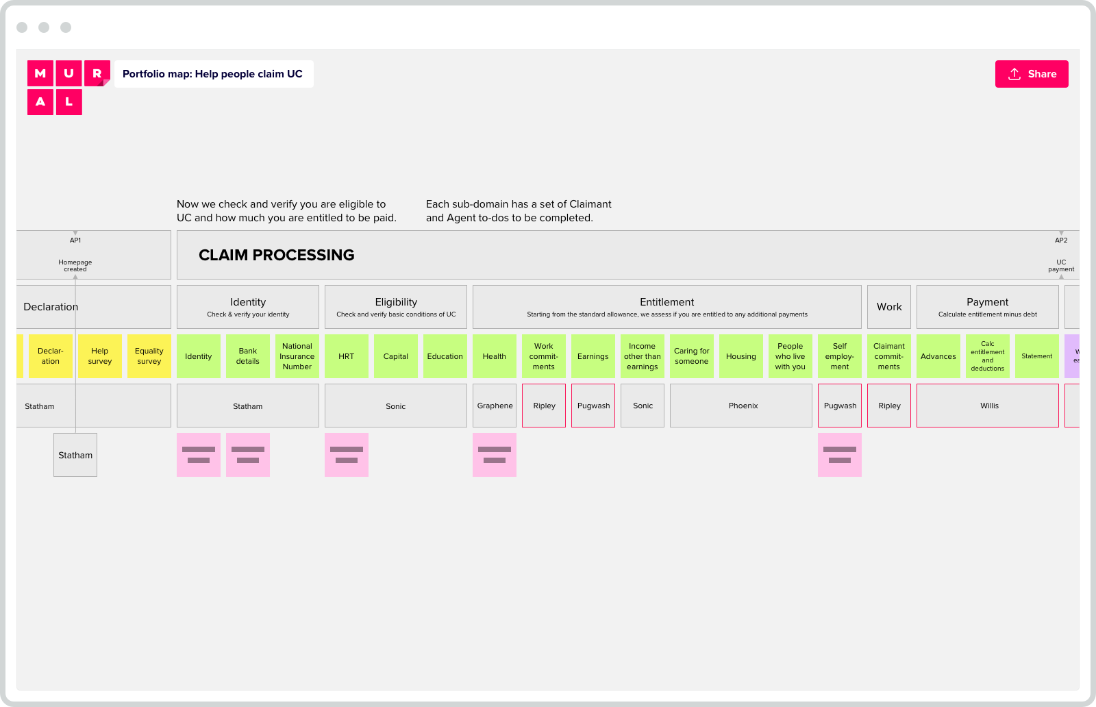
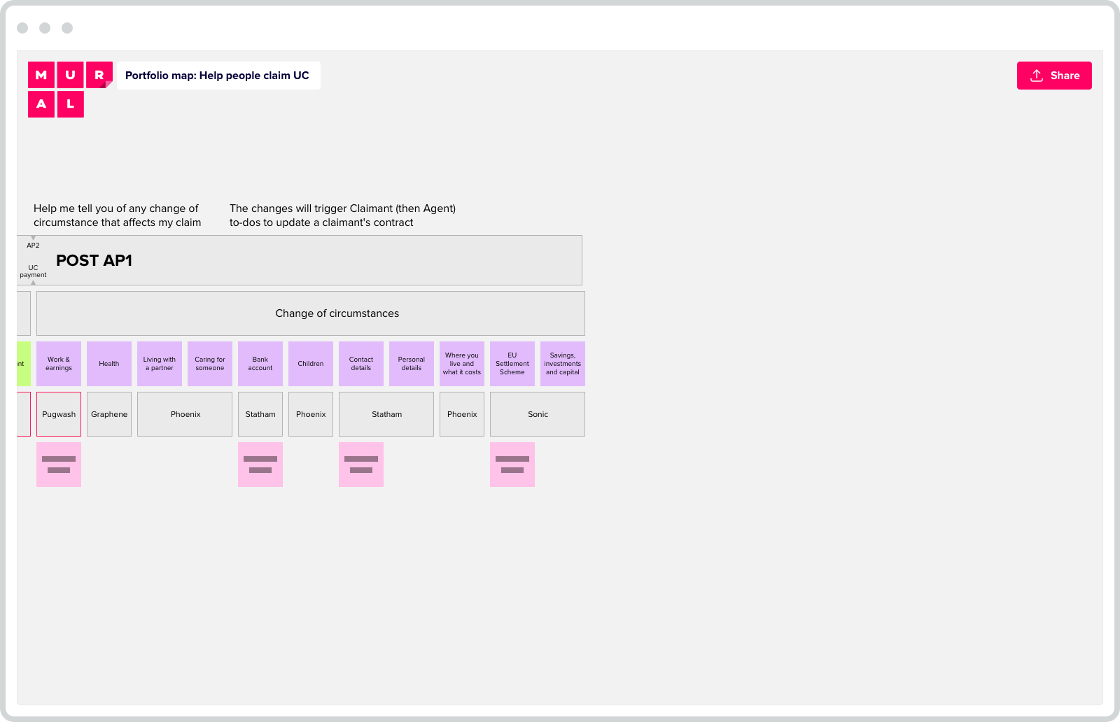
As I developed the map to show this new portfolio structure, the challenge was to keep it simple enough to be easily read and understood. This also meant it could be maintained with minimal effort to ensure the map’s continued relevance and utility.
My key objectives were to:
define and present the portfolio’s scope
clearly label areas of ownership for each theme
communicate programme strategy in a tangible way to the teams delivering the work
highlight gaps / overlaps across the service
encourage cross-team collaboration
identify new cross-team (i.e. “portfolio”) projects
#A lasting success
Through a series of workshops and show & tells, the map was socialised to all relevant portfolio and theme teams.
Ultimately, the rest of the portfolio teams created similar maps to establish a consistent full service view.


